
Scaling Generosity: A reusable donation widget for nonprofits
A donation flow that was making giving possible, but not making it feel meaningful. What changed when we led with impact instead of amount.
Product Design
B2B2C
2026
Team: 1 Dev, 1 PM, 1 UX Res
Digital Aid Seattle

Context
Digital Aid Seattle partners with nonprofits to improve their digital products. Ballard Food Bank came to us to fix their donation flow — but since we work across multiple organizations, we saw an opportunity to go further: redesign the experience once, document it well, and build something reusable for other partners facing the same problem.
The original flow was functional. People could get through it, submit a form, complete a gift. But somewhere in that process, something was off — why does selecting a donation amount feel like filling out a tax form?
Research
Research showed that the original experience made donations possible, but felt abstract, static, and harder to act on than it should be. I used those findings to design a clearer, lower-friction donation system focused on impact visibility, stronger decision support, and reusability.
Week 1
Field + Audit
Week 2
Synthesis
Week 3+
Validation
Key Insights
01
Impact was abstract
Donors selected amounts without a clear understanding of what each contribution enabled.
02
Trust was fragile and early
Users hesitated before reaching the payment step because reassurance and context came too late.
03
Donation pattern was hard to scale
The original flow worked as a static form, but not as an adaptable pattern that could support different contexts.
"I want to understand what my donation actually does."
— Donor interview participant
Concept validation
Maze test — 12 participants, unmoderated
Tested three low-fidelity donation concepts to explore how impact framing, trust cues, and information hierarchy influenced confidence in choosing a donation tier.

The B- Impact-led and C-Trust-supported models outperformed the standard widget by reducing hesitations and making donation choices feel clearer.
All these reasearch findings were used to elaborate a donor user journey that helped shape the redesign.

The challenge
Giving felt like a financial transaction, not a decision with meaning
The original widget made donations possible. But framing giving as a static financial task stripped it of the thing that actually motivates people: the sense that their specific contribution does something specific in the world.
The challenge wasn't adding more content — it was restructuring the hierarchy so that impact came first, amount came second, and the path to payment felt like a natural conclusion rather than an obstacle.

Three decisions that weren't obvious
From amount to impact
The challenge
If impact framing was the core insight, the next question was mechanical: how could choosing an amount feel meaningful without hurting scannability?
We explored a drag-based slider that dynamically paired donation amounts with impact descriptions. In informal testing, people engaged with it more. They adjusted it, played with it, and explored the range. It felt more alive than a static button grid.
The decision
We cut it anyway.
The slider was harder to scan, harder to adapt across nonprofits, and caused more errors in informal testing. The button grid was less delightful, but faster and clearer.
We kept delight in one small place: a subtle animation on the selected tier.
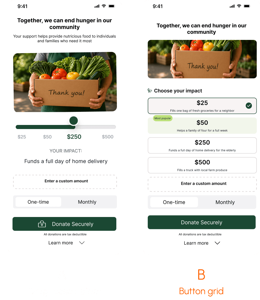
Instead of showing amounts and letting donors guess the effect, we paired each tier with a concrete, human-scale description of what it enables.

Trade-off
Less tactile exploration. More reliable decision-making. For a reusable system, predictability across contexts mattered more than peak engagement in one.
Trust cues: how much is too much?
The challenge
Users hesitated before payment because trust cues arrived too late.
Tax receipt info, fund allocation, and nonprofit registration all appeared on the payment screen — after doubt had already peaked.
So we moved reassurance earlier. The question was: how much trust content could appear before the CTA without overwhelming the decision?
The decision
We tested two versions: full trust content inline vs. one trust message with a “Learn more”.
The full version pushed the CTA below the viewport on ~70% of tested mobile devices. Some users had to scroll to find the button, and several didn’t.
The condensed version kept the CTA visible while still reducing hesitation.

Trade-off
Less transparency upfront. More clarity at the moment of decision. For a donation flow, getting someone to the payment step confidently matters more than answering every question before they ask it.
What actually makes a widget reusable?
The challenge
Designing one donation flow is different from designing a system other nonprofits can reuse.
Each organization needed to change the amounts, impact copy, branding, and messaging. But if everything became flexible, the experience would lose the structure that made it work.
The decision
We maped the widget in two layers: a fixed interaction model and a configurable layer.
The interaction model protected the core experience: how donors move through the flow, compare tiers, and reach the CTA with confidence. The configurable layer gave each nonprofit room to adapt the widget to its own voice, brand, and impact examples.
The featured tier looked like a content choice, but testing showed it was structural. Without it, users took longer to anchor their decision.

User Flow Overview
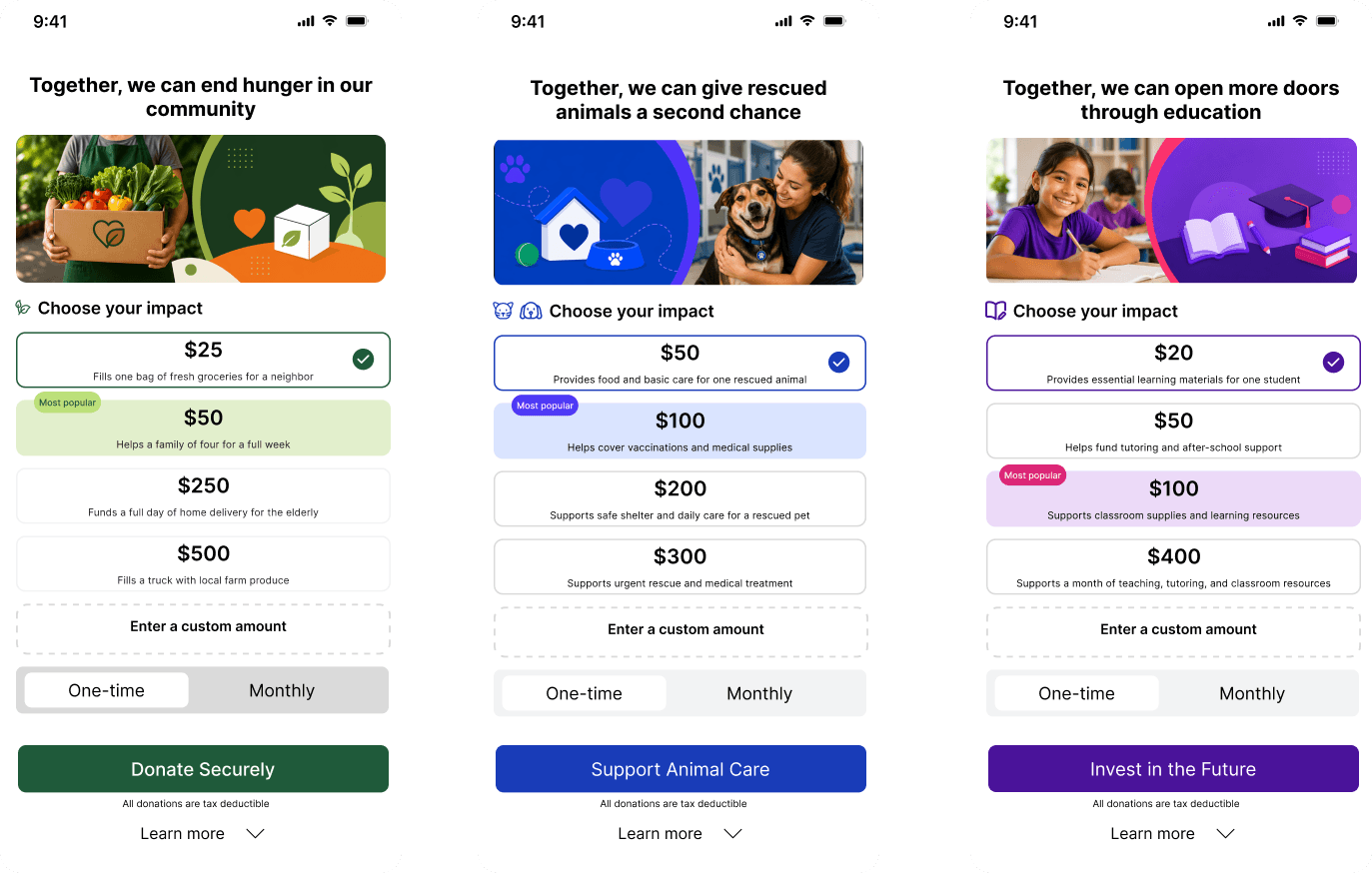
Adaptability examples
Adaptable across nonprofit contexts
The same interaction model can support different nonprofits by changing messaging, visuals, and donation impact examples while keeping the underlying structure consistent.
Design System
The design system defines the reusable rules behind the widget: shared tokens, components, states, and layout patterns that stay consistent across nonprofits, while still allowing each organization to adapt brand colors, messaging, and impact content to its own identity.


Outcomes
Prototype-level results — not production
These numbers come from Maze testing with 12 unmoderated participants. They're meaningful directional signals, not production metrics. The gap between prototype performance and live behavior is real, and I'd want to see completion rate and recurring donation data from a live implementation before treating any of this as validated at scale.
-45%
in hesitation time during tier selection vs. original flow
.Measured as time-to-selection in the tier step compared with the original Ballard flow prototype.
10/12
participants reported high confidence in understanding where their money would go
user interviews
3
concepts tested
impact-led model outperformed standard widget in every measured dimension
WHAT I'D MEASURE NEXT
A next step would be testing the reusable widget in real nonprofit contexts to evaluate completion rates, recurring donation behavior, and how different organizations adapt the same structure to their own messaging and donor needs.
What I learned
Reusability is a design constraint, not a feature
Designing for a single organization is a scoping problem. Designing for multiple organizations with different needs, brand identities, and content structures forces you to distinguish between what looks flexible and what actually can be. The most important structural decision in this project — making the featured tier fixed — only became visible when I stopped designing for one context and started designing for the system.
Delight is worth cutting when it doesn't scale
The slider was more engaging. It also broke down the moment we tried to apply it beyond Ballard. Choosing the less exciting solution because it was the more resilient one is the kind of trade-off that's easy to explain in hindsight and genuinely hard to make in the moment.
Trust doesn't have to be exhaustive to work
Users didn't need every question answered before they gave. They needed enough context to feel confident at the right moment. That distinction — between completeness and relevance — shaped every trust-related decision in this project.